cover

Progress report

I finished laying out the book! Whoo-hoo!

Of course I need to input the chapters I proofread earlier, and then proofread and input changes into the chapters I did today, but still—it’s always nice to be done with that first draft!

With the changes from the beta readers, the book is now 85,7500 words long—so a little longer than before, but not massively so. I used 10-point Georgia, and the layout is 256 pages long. I’ll have to remember to fix the spine width on the cover….

Progress report

I wasn’t really able to focus on Trials today, although I did get some good ideas last night. Instead I proofed the bonus content for the World War II letters, which are titled (horn toots pretentiously) A Dislocated World: Letters from a World War II Surgeon. I put the cover on the home page, too.

Spitballin' here

As I’m getting closer to the end of the letters, I think what I’m going to do with the World War II stuff is to have the book have no art other than the cover (easier from a production standpoint) and then have bonus content on this Web site (instead of sample chapters) that will include stuff like my grandfather’s gazillion photographs, his cute little drawings, and the art side of the postcards.

I think that wouldn’t be too horribly time consuming, and that way people will have some access without having to go to the Museum of World War II and getting into the archives. My grandfather was pretty good about identifying the people in his photographs, and sometimes included where and when, so I think it might be useful to family and historians to have the photos in particular be more accessible. I am going to have to rope off the more-graphic surgery photos in some fashion, but that should be easy enough.

I have a cover mock-up that my sister doesn’t entirely like but (as she said) it’s my book (honestly, I think she’ll like it more, or at least understand it more, once she reads the letters). And I have a title that we both like. Once the letters are all typed up, I plan to give copies of them to various family members and tell the side that doesn’t know that I’m planning to make a book out of this, so you know—totally looking forward to splitting the family and being disowned. “Everyone mentioned is dead, so they can’t sue” while legally accurate is, I suspect, an argument that will work less well with relatives….
Progress report

It was kind of one of those days, with Scribus suddenly acting up with one file for no apparent reason. But everything worked out.

I received the "final" paper copies of The Weirld (in the meantime, I of course found a typo and realized I needed to tweak something on the cover), so I sent them off to the Copyright Office. I did the cover for the large-print edition of The Weirld. And after fighting with Scribus, I made all the chapters into PDFs and combined them into one big copy--I'll either read it on the desktop or on the phone. Whew!

I might as well put up the paper covers here, right? Here's the normal one:

Weirld cover.png

And here's the large print--instead of just making it large, I did the borders because I felt like the fancy colored script would be harder to read.

Weirld LP cover.png

If you're curious, those photos were taken at Yellowstone, although they're actually pastiches.

Noodling....

I fiddling with the back jacket today--it's hard because my printer is nothing special (like, at all--I got tired of buying "nice" printers that died within the year, so I bought a $40 one with a three-year warranty that was maybe $3 more, and of course it's been chugging along without any problems). So if I can't read something easily when I print it out, I'm never sure if it's a real problem or if it will be fine when it's a high-quality book-jacket printout. I don't want all the lettering to be huge, so I made everything relatively legible....

I'm back!

I finished off my shots (YAY), and then I went on a trip I had been planning a while. Now I'm back!

The copy editor hasn't sent me back the layout yet (I might have been a little too convincing with my, "No worries about a deadline! I won't even be around!"), so today I finished up the cover for the paper book. (Now that I know how long it is, I can make the spine the correct width!) I think it looks pretty good, although I'll have to see how the first test copy turns out.

Progress report

Ugh--I tried to make a chapter ornament today (using the dragon from the cover), but it wound up being a surprisingly fiddly exercise that was not helped by the fact that I didn't get quite enough sleep last night. Some non-book stuff just came in the mail, so--I'm going to bail. I'll take another crack at it tomorrow, when hopefully I'll be better rested and things will come easier.

Progress report

Today I edited another six chapters--it's really good and relatively clean. I'm kind of hoping that's because it took me longer to write, so I went over the material several times during that process. That would be the good version. It's either that or I've completely forgotten how to edit....

Anyway, yesterday after I posted I went back to work on the cover and did the text, which I tweaked a bit today as well. I like it--I wound up not using the lettering I thought I would, but I think it's cleaner. The title frames the dragon a bit and makes it stand out more, which is nice.

Another cover!

Today wasn't very writing-friendly, but I had some time, so I decided to take a(nother) poke at the YA fantasy novel cover, incorporating some handy photos I took this summer of a volcanic wasteland. I haven't done text yet.

Getting the dragon to look like it belonged up there was probably the hardest part, and I'm not sure I've nailed it.

The back cover is just going to be another eerie photo, so it looks a bit abrupt in a layout, but as long as I do the spine correctly, it should look OK on an actual book:

I'll probably move the text box down and get rid of the plants in the foreground--they look a bit weedy there. Do YA novels usually bother with jacket copy? I'd definitely be psyched to do without....

Creating a monster when you can't draw

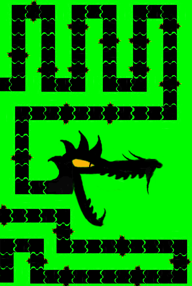
As I said, I'm working on redoing the fantasy novel cover. My original idea was this:

The idea being that 1. there is a dragon, and 2. the dragon is taking over, which is A Bad Thing.

The notion was to convey these ideas by making the cover like the video game Snake. But the book has nothing to do with video games in general or Snake in particular, so I think that cover will send the wrong message.

I still like the idea, though. I just need the dragon on the cover not to look like a video game--in other words, I need a dragon that looks a lot more realistic.

That's a problem, because I still can't draw.

I can use Gimp, however, and I feel like I do pretty well with modifying photographs. So, the White Spider legs on the cover of Trials are modified pictures of ferns that I took on a walk, and the cover of Tribulations features what was once a cup of tea.

I also feel like fantasy/sci-fi creatures need to be a bit uncanny, so it helps to use something far from what you're making--hence the reliance on ferns to make the White Spider legs, instead of using pictures of fuzzy sea life or the like. So while the dragon's body will still be snakelike, I didn't want to use a picture of a lizard or something as my basis for the dragon's head.

Instead, I used a picture that I took of a cute kitten.

I'm not going to blog the whole process, but even at this early point the kitten looks a lot more menacing.

There's a lot left to do, of course, but I think you can see how just a few changes can make something look much more eerie and fantastical.

I just shouldn't make promises during the holiday season, right?

Yeah, I underestimated how much post-Christmas crap I had to do, so sorry about that. I'm getting my shot today instead of tomorrow in hopes of getting started sometime this week (although December is also Birthday Season in my family, and we've got yet another coming up--makes for a LOT of shopping at a time when sensible people try to avoid the mall).

Anyway, I've tidied the Web page a little, and I decided that I'm going to revamp the cover of the YA fantasy novel when I have the chance. I like the general concept, but I think putting a visual reference to video games on the cover sets up the expectation that the book has something to do with video games, which it absolutely does not. So I think I'll do something similar but using a more natural-looking dragon (which I shall probably cobble together from photographs of snakes and lizards, since I still can't draw).

Progress report

I'm still working on the cover, but here's what the front/e-book cover will look like, minus the title and author's name (plus I need to clean up the head a bit).

So, it's supposed to remind you of the game Snake. It's a dragon (a bad dragon), and it's either going to be eating the book title or it's going to be breathing flames and the title will appear on the flames. Actually, looking at it here, the latter idea is just too complicated to work in that space. So, the dragon will be eating the title--sounds good.

It's still neat when this happens

So, yeah, things got busy again--we have to get everyone's ducks in a row before April 15, which can be tricky when you take into consideration the fact that some people weren't entirely aware they had ducks....

But I woke up this morning with a cover for the young-adult fantasy novel just completely there in my head. It's something that I think will be visually interesting, it's something I can do myself (i.e. it requires no actual drawing ability), and it would reflect certain plot points in the book. What I don't know (and I guess I won't know until I use it) is if it will trigger some sort of expectation that isn't fulfilled by the books itself. ("I was sadly disappointed by the complete absence of bananas in this book!")

Proofs approved!

Life has been rearing its ugly head--I had some bad chicken last night AND the smoke detector wanted me to know that its battery was low this morning, so today I'm barely able to eat, much less write. But I did get the Trang and Trust proofs back, and they were good, so I approved them.

You never know just exactly how a cover is going to look, though, and today proved that to me again. This time the Trust cover was shifted as far to the left as possible--the jacket copy was right against the edge, the spine spilled over onto the back a little, the front copy was off-center--plus the bar code was crooked. Nothing massively horrible, just a glitchy print run this time around, but you do just have to understand that stuff like that is going to happen. (And it's not because CreateSpace is God-awful or anything; that kind of thing happens in traditional publishing all the time.) It's kind of like formatting e-books: You can't control how any given device is going to render your design, so it's best not to get too exacting.